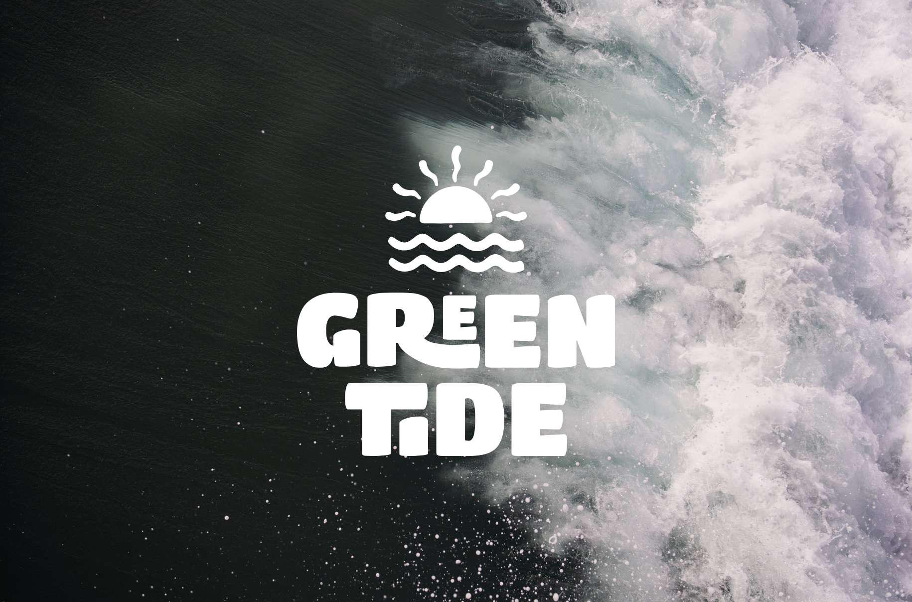
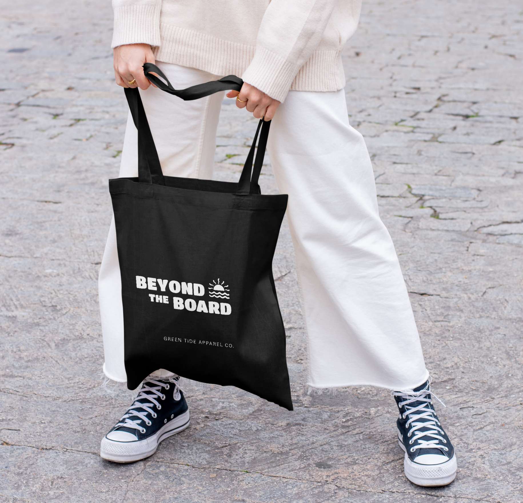
Green Tide
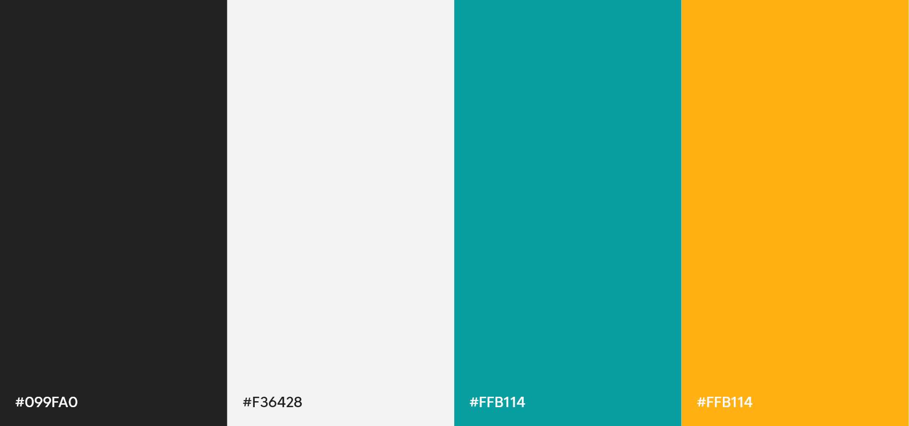
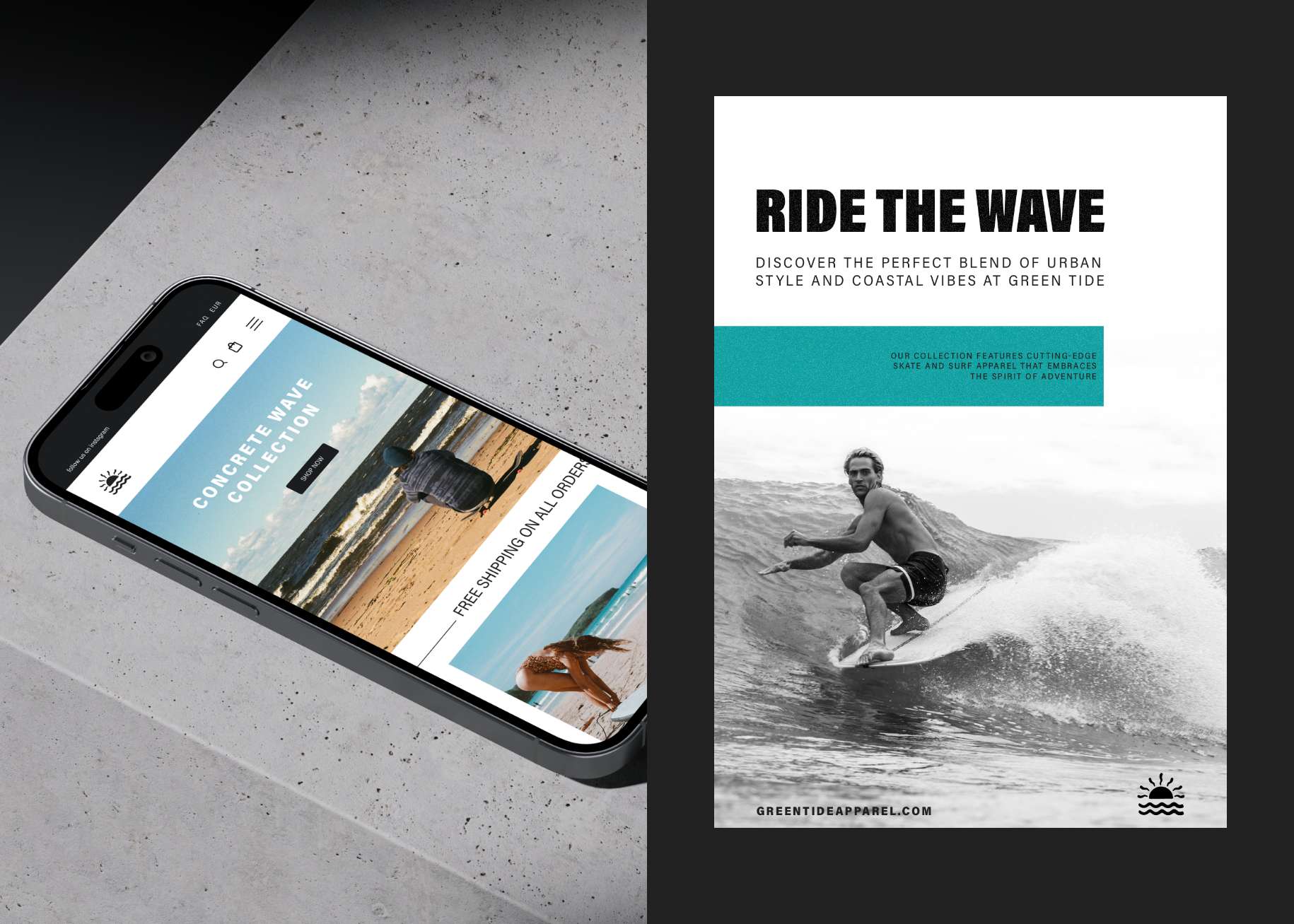
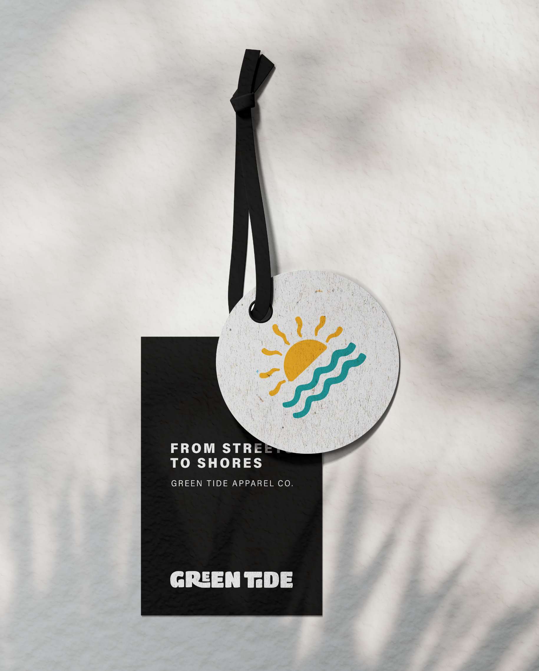
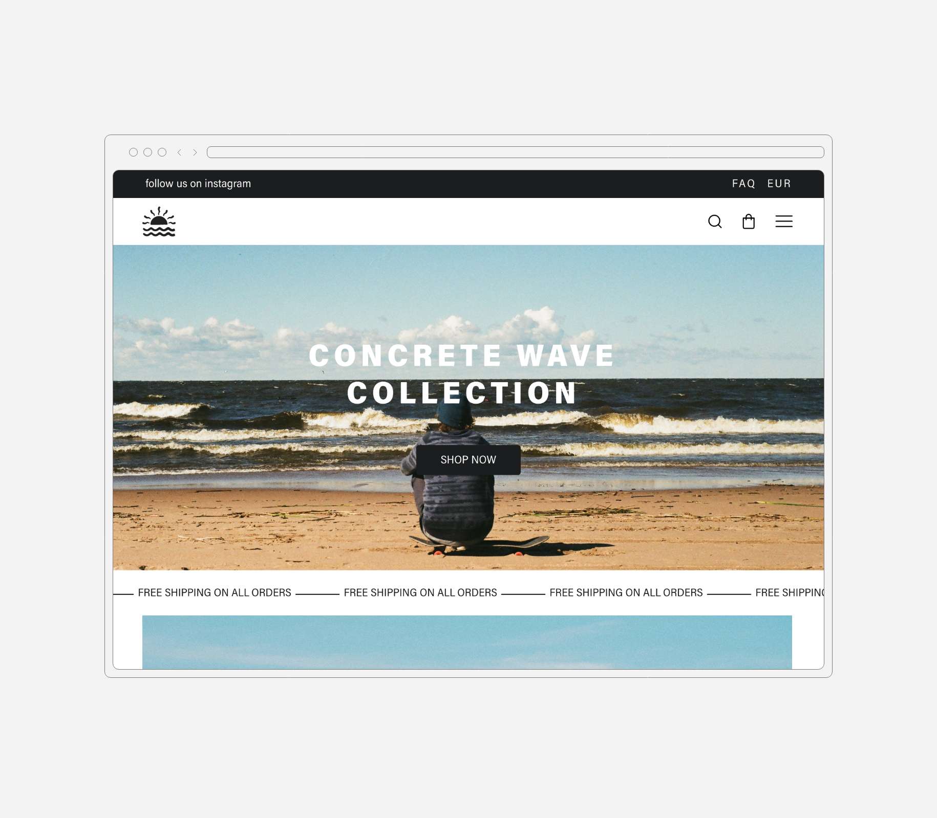
Green Tide, deeply explores the vibrant roots of skate and surf culture, capturing the audacious essence and freedom that define this unique lifestyle. The logo has been meticulously crafted, incorporating fluid curves that echo the waves of the ocean and sharp lines that reflect the urban energy of skate rinks. The chosen color palette conveys the boldness of skateboard maneuvers and the serenity of ocean waters, combining vibrant shades of yellow and blue with the attitude of black. The typography, modern and bold, evokes the dynamic energy of youth seeking the thrill of the streets and the waves. Each component of Green Tide’s visual identity has been carefully selected to convey a cohesive narrative – a harmonious fusion between the freedom of surfing and the intrepid attitude of skateboarding. This visual identity not only represents a brand, but a lifestyle, encouraging everyone to embrace the tide of adventure.
ClientGreen TideServicesVisual Identity | Branding | Web DesignYear2024